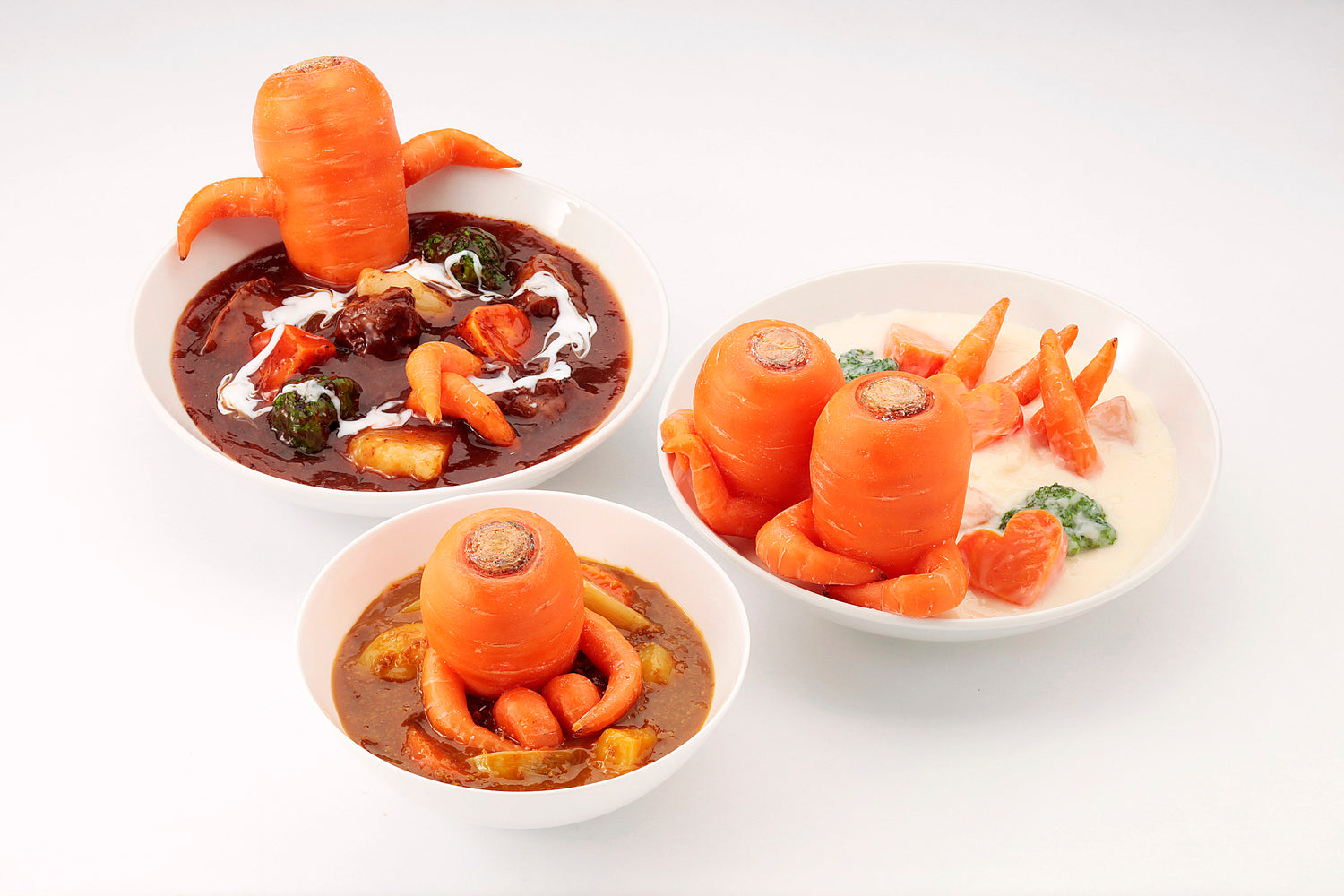

「漢字を食べ物で表現した商品をつくってみたい」。
そんな商品アイデアを、原型製作を得意とする職人が試行錯誤の末に完成したシリーズです。
漢字は食材、味覚、調理方法、ジャンルなどからヒントを得て選びました。
This is our new product "Foodish KANJI"
that has been completed through trial and error
by our craftsmen who specialize in prototype production.
We selected these letters based on ingredient,
taste, cooking method, genre, etc.


漢字の日とは?
{ 12月12日 }
「いい(1)じ(2)いち(1)じ(2)」と読む語呂合わせです。
公益財団法人日本漢字能力検定協会によって、“毎年、「いい字」を少なくとも「一字」は覚えてほしい”という願いがこめられて1995年に制定されました。


みんな大好きな唐揚げ。
カリッとした衣は、からあげマグネットと同じく手作業で仕上げています。
揚 -age- means deep-fry. "karaage is a Japanese style deep-fried chicken and everyone likes it.
「揚」の成り立ち豆知識
手を広げた形「扌(てへん)」と、日があがる様子を表現した「昜」が合わさり、「揚」が成り立ちました。油で揚げると上にふわっと浮いてくる様子が、漢字一文字で表現されています。

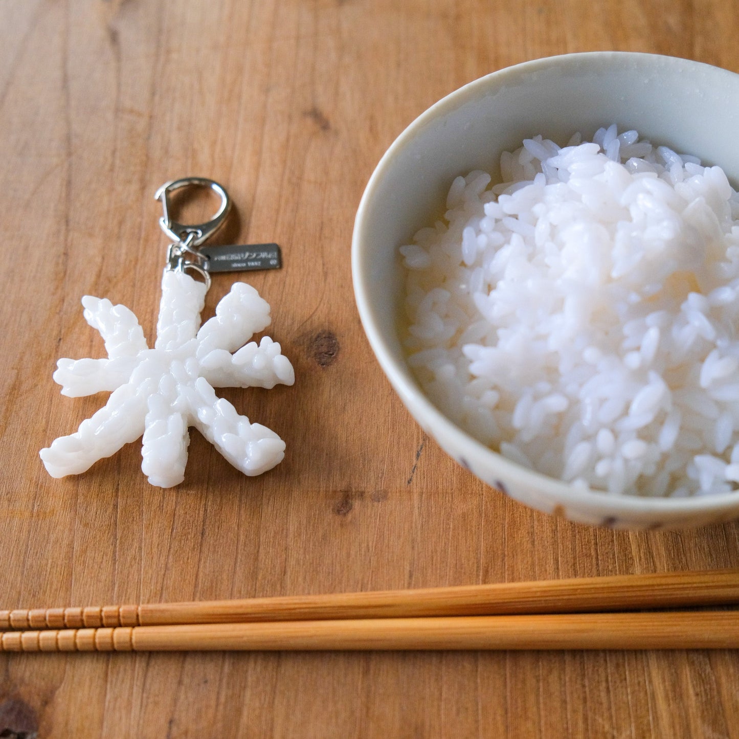
ツヤツヤとした炊き立てのごはんをイメージして作りました。
本来は点が離れている漢字ですが、原型を工夫して一体型にしました。
The kanji 米 -kome- expresses various states of rice. Among these, we made it like freshly cooked rice.
「米」の成り立ち豆知識
米という文字を分解すると八十八になり、お米を作るのに、八十八のもの手間がかかるためとよく言われますが、 穀物の稲穂を意味する横線と、6粒の穀物の実の形から「米」は成り立ちました。

和食の代表、天ぷら。
天の漢字に衣をつけて仕上げました。
漢字シリーズで一番最初にできあがった、第一号商品です。
天 -ten- is used for kanji of tempura. Tempura is a popular Japanese cuisine.
「天」の成り立ち豆知識
「人の頭部を大きく強調して示した文字」から 「うえ・そら」を意味する「天」という漢字が成り立ちました。 また「天ぷら」は、ポルトガル語のテンポーラやテンプロという言葉から できたという説や、天麩羅阿希(あぶらあげ)から 「天麩羅(てんぷら)」になったという説があります。

燃えている炭をイメージして作りました。
温度によって異なる色味を着色の技術で表現しています。
炭 -sumi- means charcoal. We made it in the image of burning charcoal. Colouring depending on the temperature.
「炭」の成り立ち豆知識
「炭」は3つの象形から成り立っています。山、削り取られた崖、そして火。「炭」の字は、木炭や石炭、竹炭など、 山から削り出して火を起こすものに表現されています。

「漢字を食べ物で表現した商品をつくってみたい」。
そんな商品アイデアを、原型制作を得意とする職人が試行錯誤の末に完成したシリーズです。
漢字は食材、味覚、調理方法、ジャンルなどからヒントを得て選びました。
This is our new product "Foodish KANJI"
that has been completed through trial and error
by our craftsmen who specialize in prototype production.
We selected these letters based on ingredient,
taste, cooking method, genre, etc.